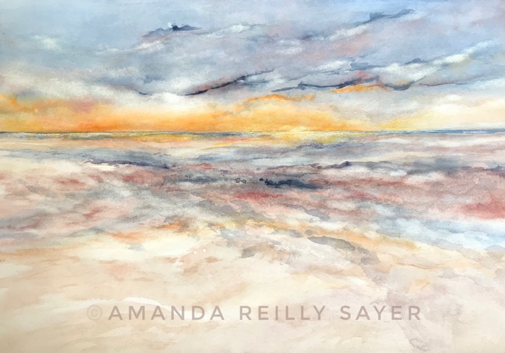
Before I knew anything about painting – only slightly less than I know now, mind you – I was heavy handed with the color purple. For no reason I can really remember, purple (one shade, straight from the tube – ugh!) was my go to color.
Then I learned to avoid it, along with the color red. An unconscious hedge against the inadvertent possibility of making purple, I’d guess.
Blues and greens were safer choices, certainly for the seascapes I’m so fond of capturing. The real problem was that I didn’t understand color mixing, among other things. And dark purple was a good cover for poorly considered brushstrokes and color choices that couldn’t be undone. Hmm… maybe I’m starting to understand why I used it so much!
I cringe to think about some of those paintings now, even as I also see how much I needed to make them. And I’ll almost certainly know this feeling again when I look back at my currently unrecognized shortcomings. So it is with growth, when we’re honest about where we’ve been. Hindsight and all that.
My learning curve as a painter is still on the rise, but I’d rather risk exposing flaws than continue hiding behind a limited palette. Or worse, stop sharing myself as I am.
Progress, not perfection, my friends!
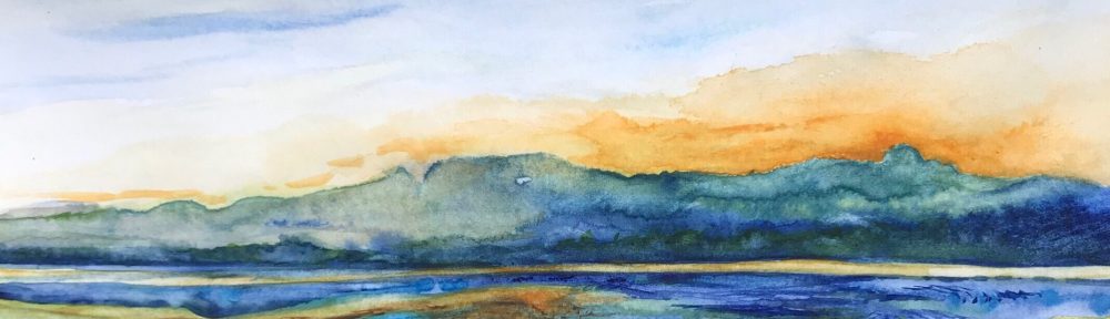
This painting, with all of its transparency, shows a bit better in person. Even so, the color palette soothes me, as I hope it will you.
What do you avoid because you don’t do it well? What colors in your life need to be reclaimed?
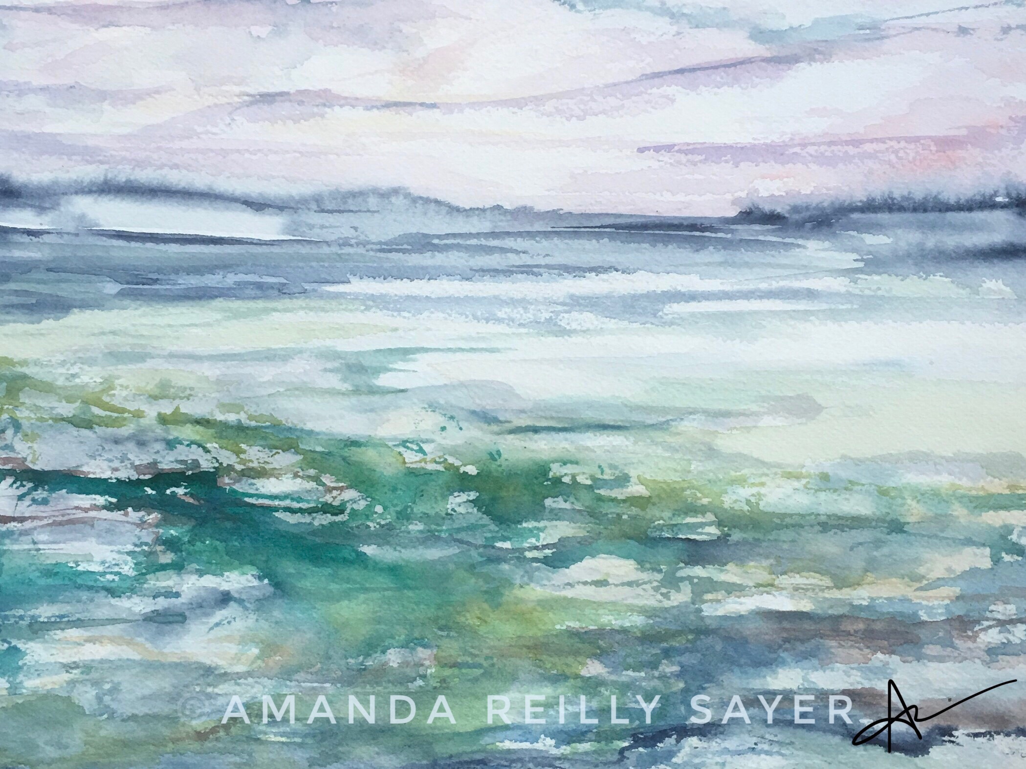
Not uncommonly, my perception of a painting changes depending on my proximity to it, not just the viewing distance, but with the passage of time. Sometimes I love a painting more the longer I look at it, sometimes less. Enduring appreciation of a painting might be one definition of merit, I suppose.
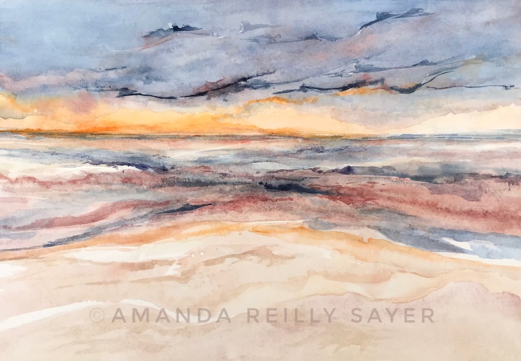
And then there is this painting, which I love best in the first moments of looking at it, when the palpable energy shouts to be heard over my notice of the imperfections. This isn’t my favorite painting for a lot of reasons and may not be yours either. But it evokes an approximation of how I felt when I made it.
Mexico is such a colorful country, a place where the warmth of the people matches the strength of the sun. There is evident hustle and work, but also an abundance of playfulness. And not just when the tequila is flowing.
Yes, there a dark places – crime, drugs, and corruption. But I’d venture to guess our impressions of those cultural elements are largely overblown.
I remember watching this painting evolve while hearing the sounds of the ocean. And, as is true with many paintings, a creative backstory is hidden in the final image. This one could be a tale of alternating ground and sky, of keeping perceptions fluid, of going with the playful energy.
When I think about my creative process, I can be admittedly fussy. The light isn’t quite right. Inspiration is lacking. Words aren’t flowing. The excuses are easy to find.
It’s not that quality doesn’t matter. But I wonder how often the insistence on the right conditions to approximate beauty is really an excuse to avoid the vulnerability of imperfection.
There is something to be said for spontaneity, for making art simply to engage in a creative act, to express something in resonance with our best energy, our loving heart.
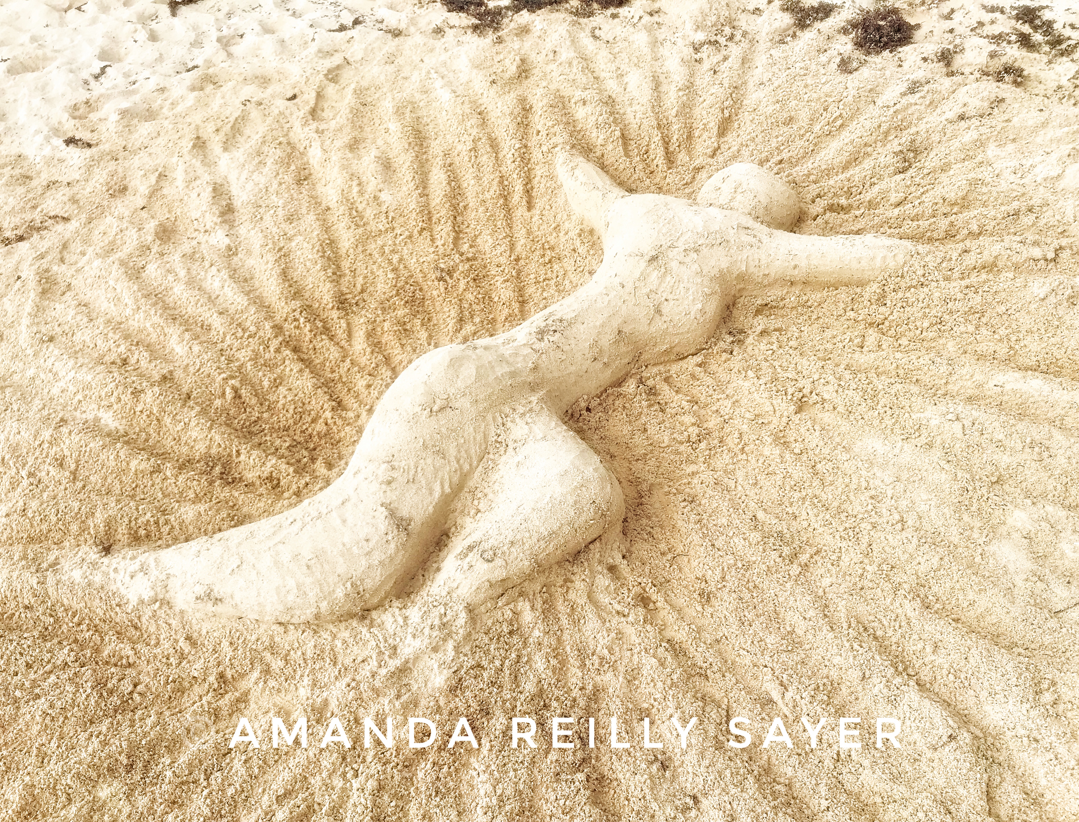
Destructive energy can be easily found, but collectively we can choose to shift the tide. One way to do that is to practice and celebrate simple creative acts. Whether it be a sand sculpture, a poem, or photograph, let’s make art where we find it!
Arguably an ability that ranks high on the list of life skills to master, it is also a valued skill to develop as an artist.
Although the inspiration to start a painting can be a challenge, the wisdom to know when it’s time to put down the brush may be even more elusive. Many of my paintings have been cast in a dull patina of excess fiddling. At the other extreme, lackluster efforts have been rescued by a few additional brushstrokes or slight color adjustment. The problem for the amateur (me) is learning to judge proximity to either pole, to make more calculated decisions about when to rest and when to push on.
If my experience is any indication, I’d guess that beginners err on the side of doing too much, desperate to fully manifest the kernel of a good idea. Masters almost certainly know when enough is enough, when to move on. Not every painting is meant to be saved.
My decision to let this painting rest has been an acute struggle. I see flaws – things I’d like to fix or explore further – and bits I’d like to preserve in a better painting. I also know that the risk of ruining this particular work is far greater than the likelihood of additional improvement. I’ve already edged into destructive territory. Perhaps my willingness to stop here is a small step towards mastery.
Addendum (day after original post): “Oops, I did it again,” to quote Britney Spears. I said I’d stop, but I didn’t. Hear me out though!
As promised, I stopped to let the painting rest. Then I looked at it. And kept looking. I’d already determined it would never be a great painting. Still, there was apparently more to learn. So, before burning it in a ritual fire, I began again with nothing to lose but time.
Ironically (considering the orignal post content), I think the painting is improved in a number of ways. Under no illusions it’s now a great painting, with areas that are evidently a little worse for the wear, I nevertheless prefer it.
What then is the lesson here?
Perhaps knowing when to resume is as important as knowing when to stop. Especially for a beginner, squeezing every last drop of learning from each creative experience may ultimately be more valuable than the final outcome.
Sometimes growth may require a step or two back before finding the right stride forward.
The before and after images are below. Which do you prefer?
One of the best things about making art is the essentially infinite possibilities. Not everything works and, of course, we all have preferences or definitions of a ‘good’ painting. Like most things in life, I suspect it’s important to find balance in painting, to blend technical excellence with expressiveness.
Recently I’ve been trying to stretch myself by working with more representational images, focusing on drawing skills and perspective. This older painting is a reminder for me to stay loose, to balance technical advancement with enjoyment, the reason I started painting in the first place.
Fellow painters: How much you play with different styles? What style you prefer for your own art making? Do you find that switching styles helps you progress?
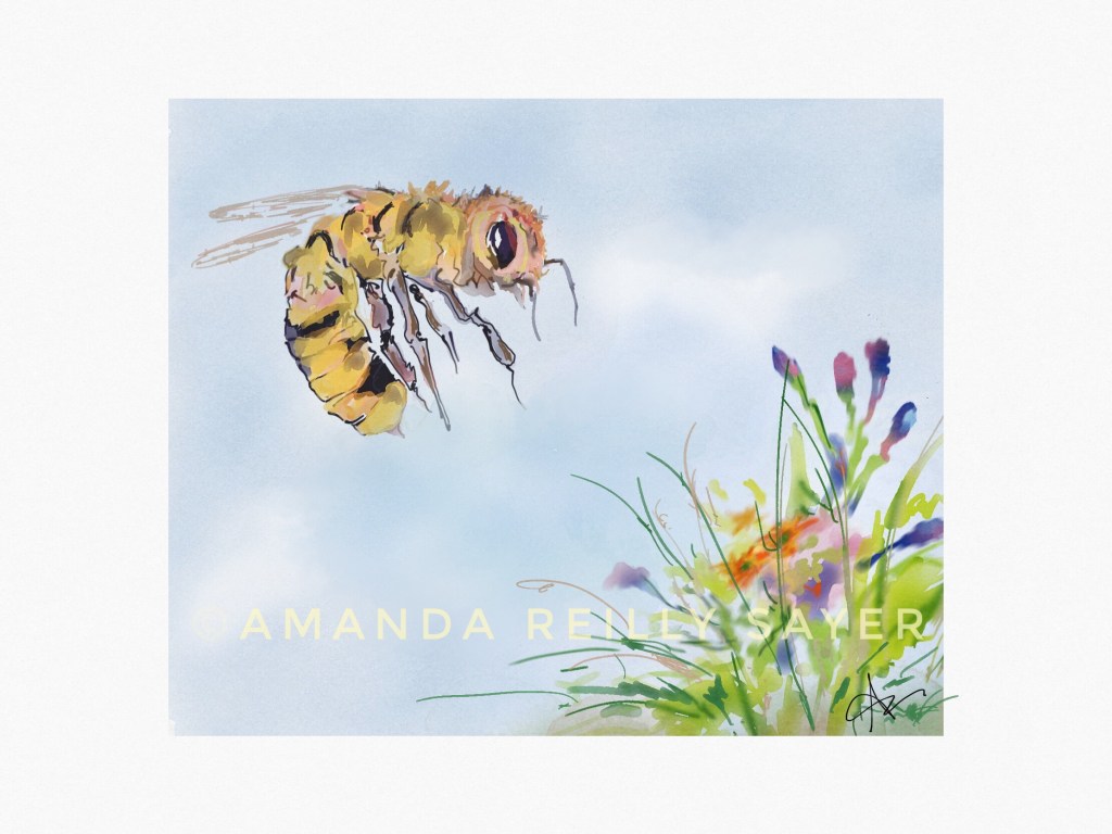
Digital painting is fun in that it allows for low-stakes experimentation with an original image. I enjoyed this playful departure from my usual, more serious approach.
Which image do you prefer? Do you agree that our culture values outcome (production) over process (being)? If so, do you think that gets in the way of being in creative flow?
My acrylic painting journey began at one of those wine and paint nights, something my husband thought would be fun for us to do as a couple. He was right! After a manageable set of instructions, each of us was encouraged to make a version of the model painting using the blobs of black and primary colors provided. There was no talk of color mixing, no real technique offered besides a caution about order: start from the top with blue fading into red/yellow sunset, next add the blue ocean, end with the black rocks and sailboat silhouette between them. Everyone happily managed their own interpretations, smiles and laughter abundant throughout. Maybe that was the wine! I remember being struck by the individual differences in outcome despite the uniform instructions and materials.
PaintNite 2014 (first acrylic painting)
This PaintNite scene (pictured), though not one I wanted to hang at home, found a place in a windowless office I used for part of my work week. It brightened the space and inspired peaceful thoughts, or so I was told by one of my adolescent patients who otherwise did not radiate calm. Despite this decided value, I knew the painting wasn’t particularly ‘good,’ something I mistakenly thought was a byproduct of the medium, not just my lack of skill. Still, I picked up some canvases and acrylic paints on sale at a local craft store. I imagined I’d host a PaintNite with friends or make paintings with my young nephews, ideas that would sit untouched in the corner of my basement, alongside those canvases and acrylic paints.
Years later…
Several years passed, dotted with intermittent watercolor painting, my preferred medium only by habit and lack of experience with any other. Then, my husband, catalyst and longtime supporter of my artistic efforts, gifted me a portable plein air easel. He apparently imagined me on the French countryside, complete with beret and smock, his imagined representation of an artist. And what a lovely way to be envisioned! But he didn’t know that type of easel, which doesn’t adjust to fully horizontal, isn’t ideal for watercolor painting. Although I skipped the beret and smock, I decided to honor the gift by bringing canvas and paints up from the basement, to give acrylics another try on my new easel.
You might wonder whether I thought to research acrylic painting techniques before I began, something that seems obviously wise now. Naively, I thought I knew all there was to know about applying acrylic paint, having had the introductory lesson at PaintNite. I know, I know – hindsight is humbling! In my defense, my art education stopped in middle school. I thought ‘good’ painting was done with either watercolor or oils, a medium off-limits to an amateur, the brush cleaning alone beyond my capacity. It hadn’t occurred to me that acrylic painting, like so many deceptively simple things, can also be complex and render beautiful scenes.
Without expectations, or skill, I set up the easel and started putting paint on canvas, intending to make a rock breakwater, something I’d struggled to master with watercolor paints. No surprise, the rocks were not a success in this painting either. But to my delight, I discovered that with acrylic painting even a dark mistake could be painted over with a lighter color, not really an option with watercolor.
New Medium, July 2018 (2nd acrylic painting)
The final result (pictured) looked closer to what I considered a ‘good’ painting might look like. It wasn’t great, I knew, but it was better than I’d expected it could be and motivated me to keep playing with this new medium.
So much more to learn…
Since then I’ve made several acrylic paintings of varying quality and have recently decided to learn more about technique and application. There is a lot to learn! It’s tempting to see all the paintings I’ve made to this point as not ‘good’ through the lens of increased knowledge and experience. For example, initially more focused on color and composition, I didn’t realize visible brush strokes might add to, or detract from, a painting. Poor paint coverage is also a thing, which doesn’t affect the gestalt but really makes for a poor quality painting on the close up. This final painting (pictured at the top), my third of the medium, exemplifies both kinds of mistakes.
My definition of a ‘good’ painting has shifted, and will, I suspect, continue to evolve. Still, there is something about this painting, even with the noted imperfections, that keeps me from painting over it. Even that PaintNite painting was beloved by at least one person and was therefore valuable, if primitive in other ways. These paintings remind me that while we can evolve in technique and knowledge, we can also appreciate and honor where we’ve been. We can define ‘good’ broadly.
In other news, although I’ve thus far managed to talk my husband out of the need for an artist’s costume, he occasionally still wonders aloud, “Wouldn’t you like a beret?” Maybe someday I’ll decide that would be a ‘good’ look for me.