
Before I knew anything about painting – only slightly less than I know now, mind you – I was heavy handed with the color purple. For no reason I can really remember, purple (one shade, straight from the tube – ugh!) was my go to color.
Then I learned to avoid it, along with the color red. An unconscious hedge against the inadvertent possibility of making purple, I’d guess.
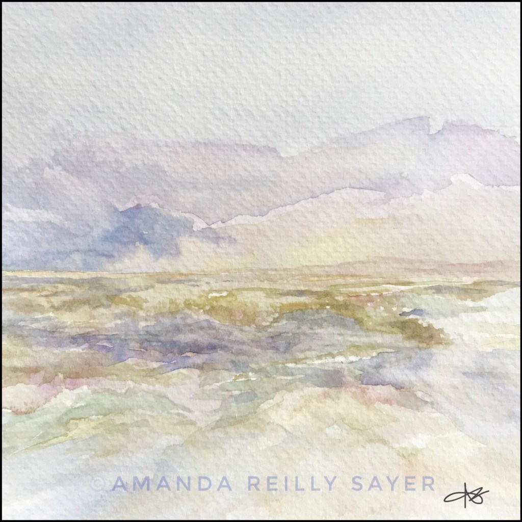
Blues and greens were safer choices, certainly for the seascapes I’m so fond of capturing. The real problem was that I didn’t understand color mixing, among other things. And dark purple was a good cover for poorly considered brushstrokes and color choices that couldn’t be undone. Hmm… maybe I’m starting to understand why I used it so much!
I cringe to think about some of those paintings now, even as I also see how much I needed to make them. And I’ll almost certainly know this feeling again when I look back at my currently unrecognized shortcomings. So it is with growth, when we’re honest about where we’ve been. Hindsight and all that.
My learning curve as a painter is still on the rise, but I’d rather risk exposing flaws than continue hiding behind a limited palette. Or worse, stop sharing myself as I am.
Progress, not perfection, my friends!
This painting, with all of its transparency, shows a bit better in person. Even so, the color palette soothes me, as I hope it will you.
What do you avoid because you don’t do it well? What colors in your life need to be reclaimed?

glad you’re feeling centered enough to revisit purple. it is one of the favorite colors of those with ‘beginner’s mind,’ aka kids. i have recently considered how much i actually see for the ‘first time’ each day. if i’m honest, i’ll say that most days, it’s nothing at all. so it’s inspiring to see someone revisiting the ‘previously known’ in order to re-see what was perhaps always there but hidden heretofore. if that makes any sense.
and anyway, i like the painting!
ed
LikeLiked by 1 person
Yes, you make good sense! For me, in this particular case, it was less about re-seeing and more about re-learning how to effectively make use of a color I’d poorly applied in the past. But, as with so many things, this too offers a metaphor for life 🙂
LikeLike
Thank you for visiting, Amanda. I am glad I got to see your wonderfully delicate paintings. Why not make purple your signature color? I don’t see anything wrong with having favorites. As for me, I always get a little anxious when painting a green meadow. Firstly, the wrong shade of green can make a watercolor painting look kitschy. Secondly, establishing a foreground, middle ground, and background, and keeping perspective in mind, can be quite challenging.
LikeLike
Thank for visiting me, and for your thoughtful comment. Your work is beautiful. You meet the challenges you speak of very well!
LikeLike
Thank you, that’s very kind. — Laureen
LikeLiked by 1 person
Your paintings are just gorgeous. I love the soothing colors and roll of the landscape. Have you ever written poetry to accompany them? (hint hint). Ha ha. And thank you for the “recent post” menu. It was such a pleasure to land here. 🙂
LikeLiked by 1 person
Thank you so much Diana. I greatly appreciate the feedback about the paintings and the “recent post” menu.
As you may remember, I’m new to blogging and still learning about the platform, in addition to managing the vulnerabilities of sharing creative work, etc.
I like your idea about writing poems to accompany paintings. That may happen at some point. Or it may not. I try not to force these things 😉 In a way, the paintings are poems already, so adding words to them might muddy the waters. Besides, whatever would I do with all the photographs I make, if not to pair with my poetry. Ha!
Again, I’m so grateful for your counsel and your time, Diana!
LikeLiked by 1 person
What a beautiful thought that painting are already poetry – I quite agree. ❤
LikeLike
Well…I made no promises, but you inspired me. Here’s a new painting with an accompanying haiku: https://amandaart.poetry.blog/2019/03/13/haiku-18-and-a-new-painting/
What do you think? The haiku adds or subtracts from the experience?
LikeLiked by 1 person
Oh. Heading over!
LikeLiked by 1 person
Your paintings just draw me, Amanda. This one is so soft and feminine. I somehow got lost in the “landscape” and forgot where I was for a while. And color? I’ve just reclaimed yellow. For years I didn’t think yellow looked good on me but even today I am wearing bright yellow. I only like certain tones of red although I like a reddish “hue” to many of photos. See? Even my comment is a bit convoluted. LOL
LikeLiked by 1 person
I’m so grateful you stopped by Amy. And love that you’re drawn in by the paintings. There is no better compliment!
Isn’t it funny how we create narratives about what colors we like? I’m a redhead and have therefore been inundated with rules about what colors I should and shouldn’t wear. Only recently have I understood that every color has a hue that can be lovely, even on a redhead 👩🦰💚
LikeLiked by 1 person
LOL Relate. 100%. Inundated is a good way of putting things into perspective. I’ve gotten good at putting together colors that are out of the “norm”. And believe me, it feels good. It also feels good to throw away what I was “taught” to do and instead what I wish to do. (((HUGS)))! 💖
LikeLiked by 1 person
Wonderful paintings🙂
LikeLike
Thank you so much for the kind feedback!
LikeLike
This one is so soothing and calming. Purple is good – and just happens to have a high spiritual vibration
LikeLike
Thank you. One thing I love about watercolor painting is the vast range of ways the pigment (and water) can be used. These very subtle paintings don’t show as well by photograph, but I’m glad you can feel the soothing energy!
What I didn’t say in my original post is that my early paintings (predominant in purple) were very much connected to my spiritual development. I can say this for sure in retrospect.
Your comments have been soul gifts to me. Thanks again 💚
LikeLiked by 1 person
I tried watercolour a very long time ago – unsuccessfully.
LikeLike